Block Print
|
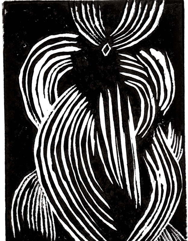
Graphic DistorionMedium: Block Print
Size: 23 cm by 15.5 cm September 2015 Exhibition Text: The inspiration of this piece comes from the art pieces known as Zen Graphic Notation and the German Expressionism artist known as Käthe Kollwitz. The black jagged lines took their inspiration from her Self Portrait and the spontaneous and inconsistent patterns and turns within the lines were inspired by the overall theme that is usually found in Zen Graphic Notation pieces. The theme of the piece is distortion because the piece does have any continuous or clear patterns. |
Inspiration
|
In my freshmen year in art I had done a project that was classified under an art type called Zen Graphic Notation. This project involved using a sharpie marker to make spontaneous and inconsistent patterns and figures all throughout the piece. This project was something that I wanted to incorporate with another project since I was first introduced to it. The Block print pieces that my peers and I had to complete felt like a great opportunity for me to finally use the style and ideology of the Zen Graphic Notation pieces, despite that I still wanted to use another art movement that I felt would work with Zen Graphic Notation. The artist that had came to mind was Käthe Kollwitz with her famous self portrait that was created with only two color compositions. The rules that I had to work with consisted of:
|
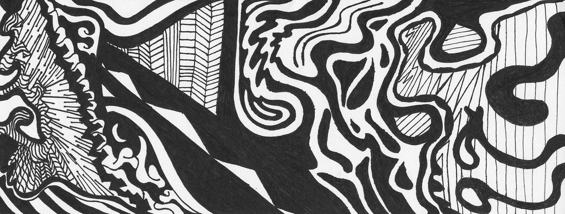
Zen Graphic Notation Example
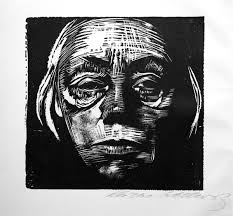
Käthe Kollwitz Self Portrait
Picutures for final - Art History 1020 with Lilje at Tulane University - StudyBlue. (n.d.). Retrieved December 15, 2015, from https://www.studyblue.com/notes/note/n/picutures-for-final/deck/1761505
|
Research
Käthe Kollwitz was a German expressionism artist that had witnessed two world wars and much sadness in grief in her life time and from those experiences and grief filled moments, she created much art work. Her artwork that she indeed did create express a somber and depressing tone due to the expressions in her portraits. Since I was using her self portrait as a source of inspiration that was what I had chosen to focus on. The meaning and goal of her piece was to express compassion for all the; men, women, and children that have suffered during the world wars, she had then began dedicating herself to printmaking. She felt that print making was the most suitable artwork as a political commentary at the time and that they were the most powerful. Her peaces certainly held up my requirement for expressing the theme of distortion as well. When I had researched the Zen Graphic Notation I was happy to know that there had not been much change in the ways these pieces are created since I had started creating them. The same methods were used, fine point sharpie markers and simple thick forms of paper.
Links : http://www.moma.org/collection/works/160136?locale=en
http://mrchads.weebly.com/zen-graphic-notation.html
Links : http://www.moma.org/collection/works/160136?locale=en
http://mrchads.weebly.com/zen-graphic-notation.html
Creation and Sketches
|
After completing all my planning sketches I decided that my last and my first sketch had captured the theme of distortion best while taking inspiration from Käthe Kollwitz's self portrait and as well as the tone from the Zen Graphic Notation style pieces. I then began carving the rubber etching that we had to use to create our printouts and unlike other projects that I had done in the past, I had not created some sort of template that I could trace of off or use as a guide. I was completely carving by hand without any sort of ruler or tool that was meant to help create something specific. I was looking at the planning sketches that I was pleased with most and a picture of Käthe Kollwitz's self portrait. During the carving I had to be sure to keep all the rubber that I was removing out of the crevices and spaces that I had carved.
ReflectionIn conclusion for my Block print, I'm very pleased with the final result, for areas for improvement, I would consider making a whole different design with a separate carving so that way I have more than one option to choose from.
|
|
